
November 24, 2025
Most buyers conduct their research online long before they contact a salesperson. About two-thirds of B2B buyers discover products through internet search results. If...
A study conducted by Stanford University found that 75% of users form opinions about a company’s credibility by assessing its website design.
This number is significant and highlights the importance of website design for businesses.
A poorly designed website may damage your business’s reputation and drive potential customers away. It is essential to give importance to website design and keep current with the latest best practices.
With the multitude of new technologies and trends arising annually, determining where to concentrate your efforts when creating your website can be challenging.
That is where the do’s and don’ts for website design come into play. Today, let’s discuss key factors to consider when creating a website to ensure a visually appealing, effective, and goal-oriented site.
1. Focus on Consistent User Experience
It is essential to adopt responsive web design and have a good understanding of key tips for responsive web design. Consistency in user experience must be maintained on all devices. Users can reach your website via smartphones, tablets, desktops, or other devices.
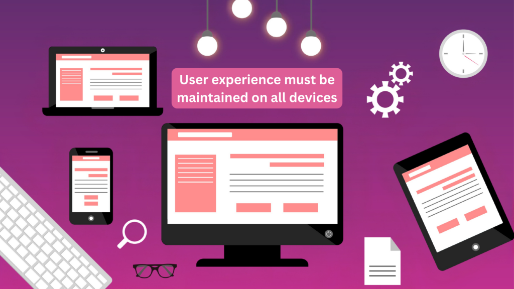
In each of these instances, the UX design ought to offer a comparable experience for your customers. No matter how users access your website, they should have access to the same features across all platforms. This is something that professional web designers usually remember.
The user-focused website design of Airbnb has enabled them to engage with a larger number of customers, generate more reservations, and enhance brand recognition.
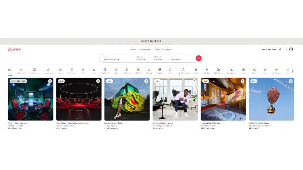
Source – Airbnb
2. Have a Smooth Navigation
Navigation in web design is a crucial element that significantly impacts your website’s usability. Despite having a feature-rich website, the quality of your customer’s experience will be diminished by a lack of smooth navigation.
Make sure to simplify the format as much as you can. The visitors should be able to understand and clearly see the navigation options easily. Ensure that the navigation system on your homepage matches the navigation on all other pages. The navigation system needs to be structured to assist visitors in finding the information they need with as few clicks as possible.
3.Make the Pages Easy to Scan
Customers don’t stay on a website for long unless there is a captivating feature. The users will probably skim your pages instead of reading them word for word. As a designer, it is important to create visually appealing website presentations for easy scanning by visitors. Focus on the main parts, such as the navigation links, login forms, screen headings, and other vital components of the website.
Check out the Hostinger website and see how, even though it is a well-known brand, it prioritizes simplicity and ease of use.
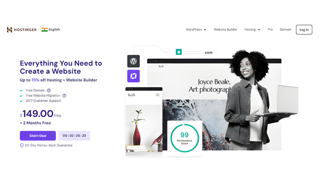
Source – Hostinger
4. Choose Typography Carefully
Using typography can be difficult and one must be careful in how they use it for their important projects. This tool can change a design positively or negatively. Therefore, it’s important to allow ample room for contemplation when selecting a font. For added caution, it is recommended to limit the use of typefaces to just 2-3 in a design. This is a fundamental guideline for website typography. Using an excessive number of font styles and various colors can be unappealing and result in a design that doesn’t leave a positive impact.
Take a look at Clagru’s’ uncomplicated and visually attractive typography that aligns with their brand’s style and voice.

Source – Clagru
5. Use White Space Effectively
Even though white space suggests simplicity, it can still be confusing if you are unfamiliar with how to use it correctly. Balancing the text-free areas is crucial in website design; an excess makes a page look empty, whereas a shortage can result in cluttered content.
An excellent demonstration of effectively utilizing empty space can be seen on Apple’s website. Look at how effectively they have preserved the equilibrium.
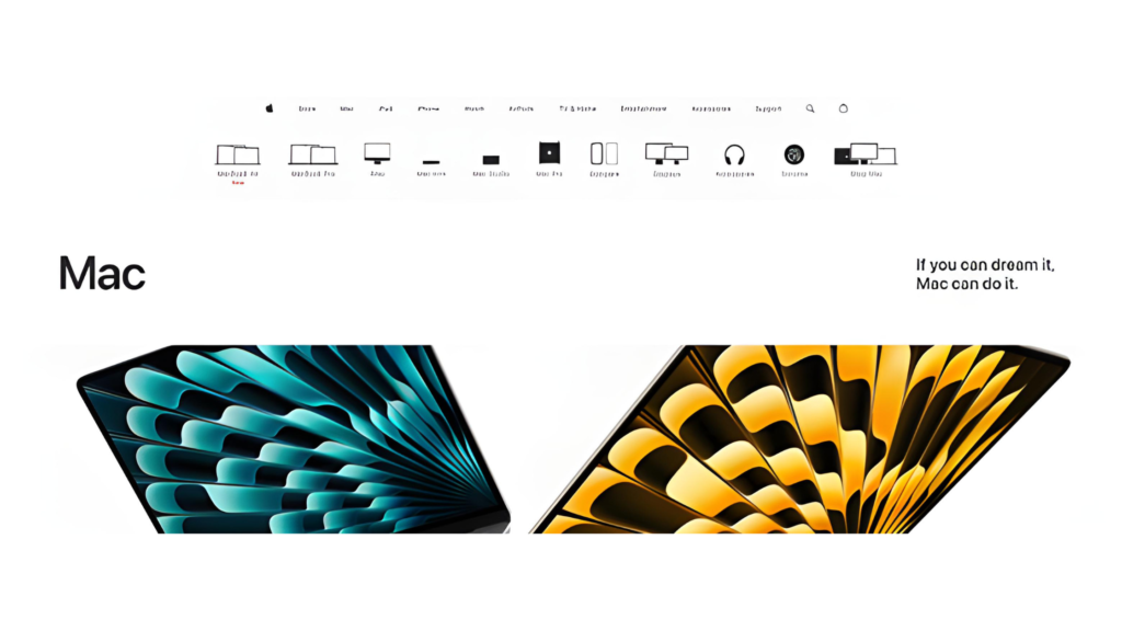
Source – Apple
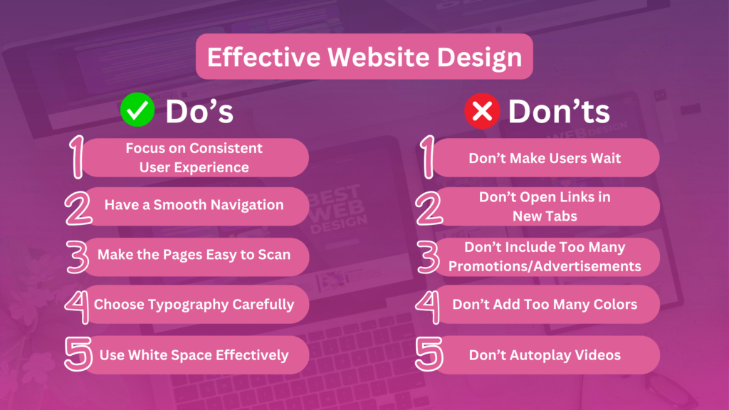
1. Don’t Make Users Wait
You might have conducted extensive research on effective web design techniques. No matter how impressive the design is, if it loads slowly, all other aspects are pointless. On average, customers typically switch to another website if it takes longer than 3-5 seconds to load. Ensure that the speed at which your site loads is quick.
Consider the graphics and design elements, and ensure to adjust their size so that the website loads quickly. You can achieve this by compressing CSS and JavaScript files to decrease the loading time of the website.
2. Don’t Open Links in New Tabs
Customers anticipate returning to the previous page by selecting the ‘Back’ button. When a user tries to open an internal page in a new tab, they will not have access to this option. This can also result in multiple tabs appearing on the screen, which the users may find undesirable. Create your website so that visitors can access an internal link without opening a new tab.
3. Don’t Include Too Many Promotions/Advertisements
Keep in mind that the content on your website should be distinct from the other components on the page. Make sure your content is not overshadowed by promotional materials. Position the ads strategically on your website to avoid interfering with the important elements.
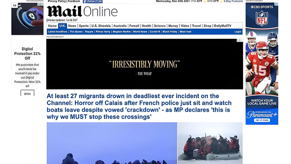
Source – Daily Mail
4. Don’t Add Too Many Colors
Balance in colors is essential for a well-designed website. It will be challenging to keep a balance if additional colors are incorporated. Furthermore, it will communicate numerous things that the visitors will struggle to follow. Similarly, employing an excessive number of different fonts can be distracting and cause confusion. At times, it can be quite frustrating to gaze upon. Therefore, it’s advisable to limit yourself to using a maximum of three typefaces in three varying sizes.

Source – Alpha1TechLabs
For example, consider the color selection of the above website, which seems to be like a man suggesting ‘Hey, let’s go with the colors of the rainbow’ and the website developer simply went along.
5. Don’t Autoplay Videos
Users are irritated by websites that feature auto-play music, background sounds, and videos. You should only use them in moderation, specifically in locations where the visitors anticipate their presence. If you wish to add a video to your website, allow users the option to play it themselves.
Consider CNN. It’s not just about selecting an article or movie and rushing to lower the volume abruptly. You also feel a disturbing lack of control during these occurrences. You didn’t select what to watch; the website or app made that decision for you, requiring you to turn off the annoyance.
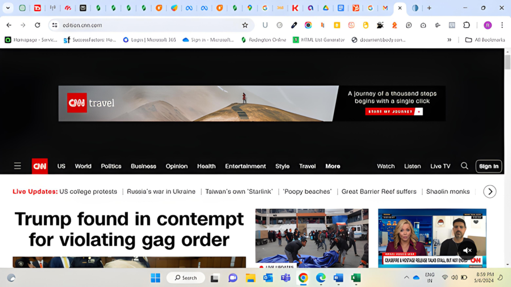
Source – CNN
In conclusion, website design plays a pivotal role in shaping a company’s credibility and reputation. By adhering to the do’s and don’ts outlined above, businesses can ensure their websites are visually appealing, user-friendly, and goal-oriented.
If you are looking for professional assistance in creating impactful websites that drive results, look no further than DealsInsight’s website designing service. Elevate your online presence and captivate your audience with our expertise. Visit our website today to learn more and kickstart your journey towards digital success.
Most buyers conduct their research online long before they contact a salesperson. About two-thirds of B2B buyers discover products through internet search results. If...

Introduction Email marketing is still a top performer. One of the most powerful tools that marketers still have in their hands is email marketing,...
You’re writing about a product, a concept, or a person, and Google seems to know exactly which one you mean! Even if you never...